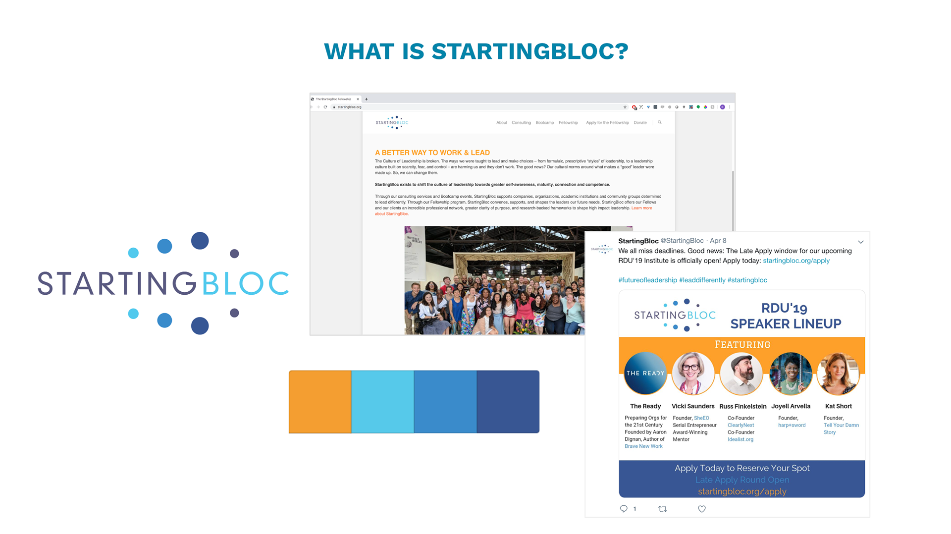
StartingBloc is a 15 year old non-profit with a global fellowship community (3,000+ Fellows across 56 countries) focused on leadership development in sustainability and equity.
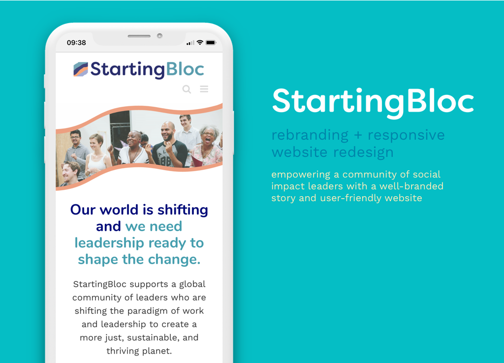
The goal was to create a refreshed, unique visual identity aligned with StartingBloc’s matured vision and improve StartingBloc’s storytelling + web presence. I worked directly with the CEO and executive staff.
The old brand :(
Challenges
Organization struggles with an amorphous identity, generic visual style, outdated color palette too bright for their brand, inconsistent storytelling, poor visual design (not enough white space, mixing too many typographies, unclear visual hierarchy, too much text), not mobile friendly - despite 55% of audience visiting from their phones.
Good News
The CEO had a vision for the brand’s growth and had spent the year previous working on a refined vision, mission, and beliefs that we could use to guide our storytelling and visual representation of the brand experience.
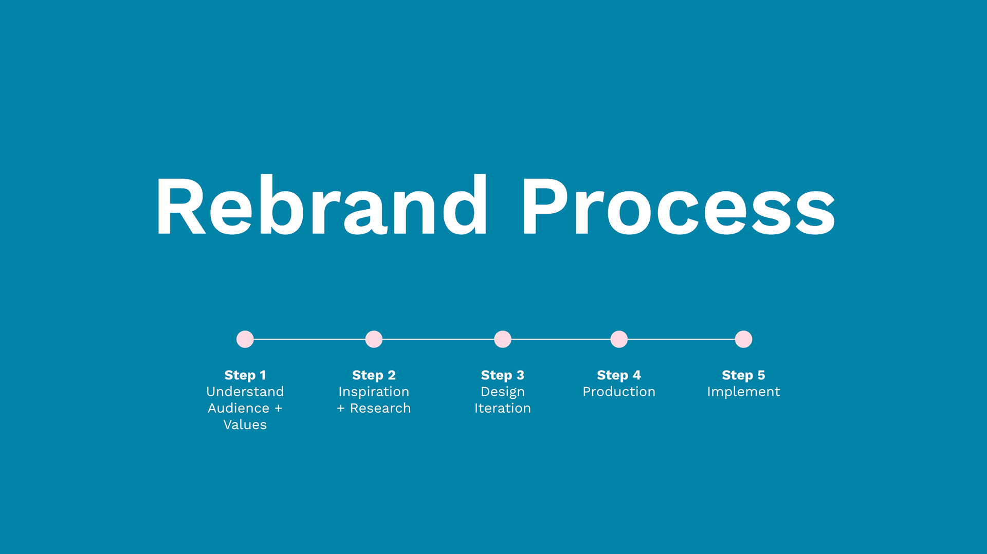
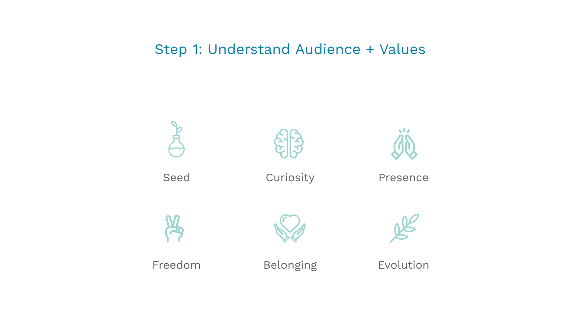
We started by focusing on the main audience: the Fellowship community - global, diverse, wide range of ages and industries.
I normally support the effort of defining mission, vision, beliefs as a foundation for the value proposition and story telling.
In this case, the organization had already done a lot of this work, so my job was to refine it and make it come to life.
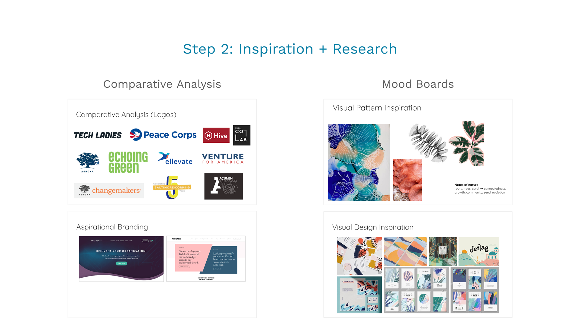
I worked with the CEO to research inspirational brands and create mood boards that focus on the values. You can see the notes of nature with roots, tress, coral in relation to connectedness, growth, and evolution.
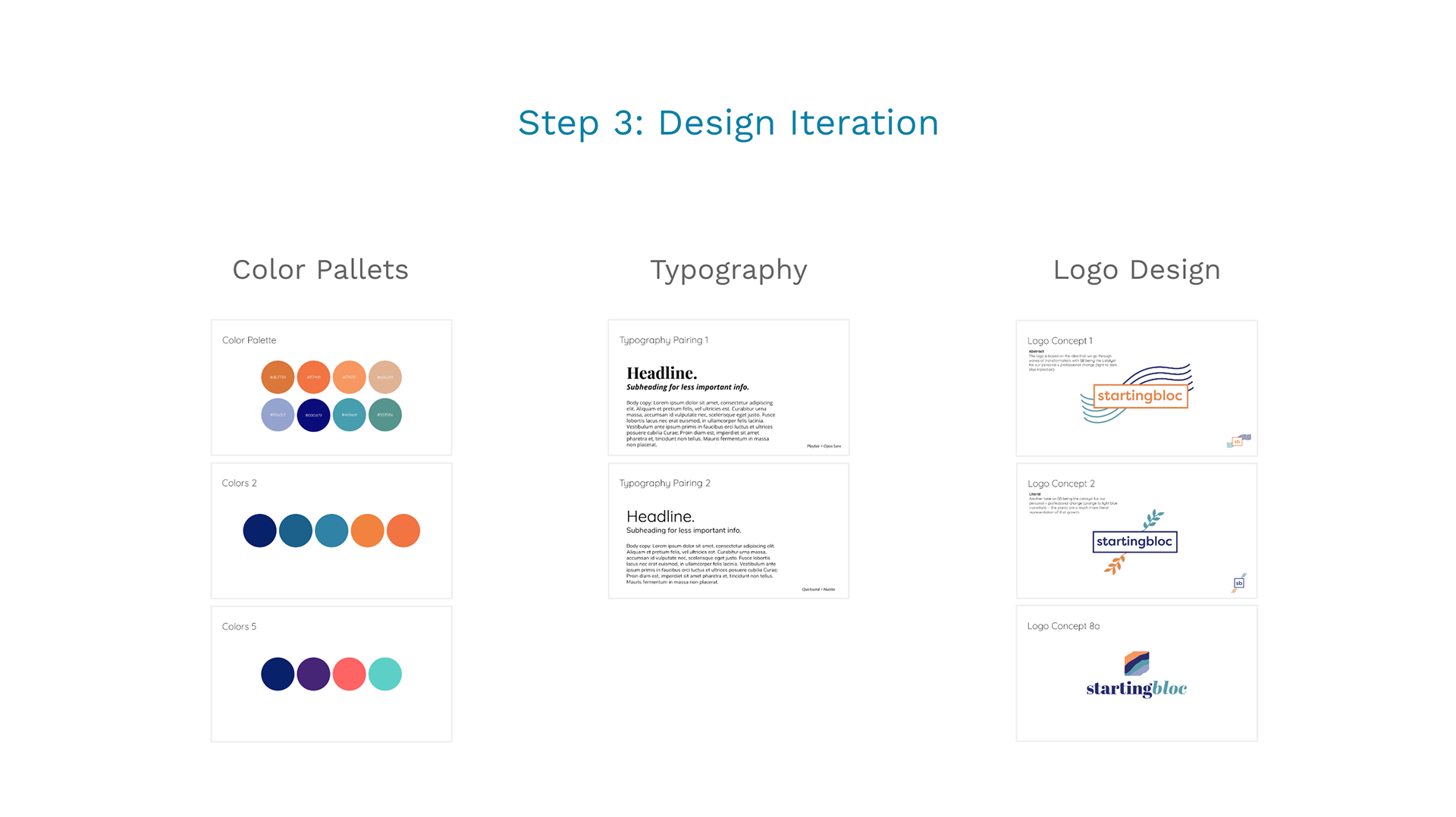
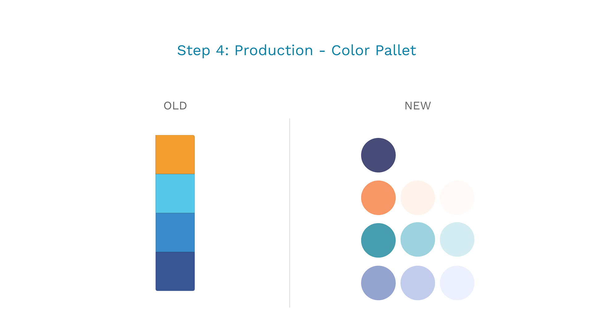
Major challenge: Accessibility - building contrast and a dynamic enough palette to have really fun visual implementation.
We wanted to pay homage to the current brand by sticking with blue and orange, but implemented with muted colors that were deeper and more mature.
We expanded the palette to include more options for implementation (lighter shades for background).
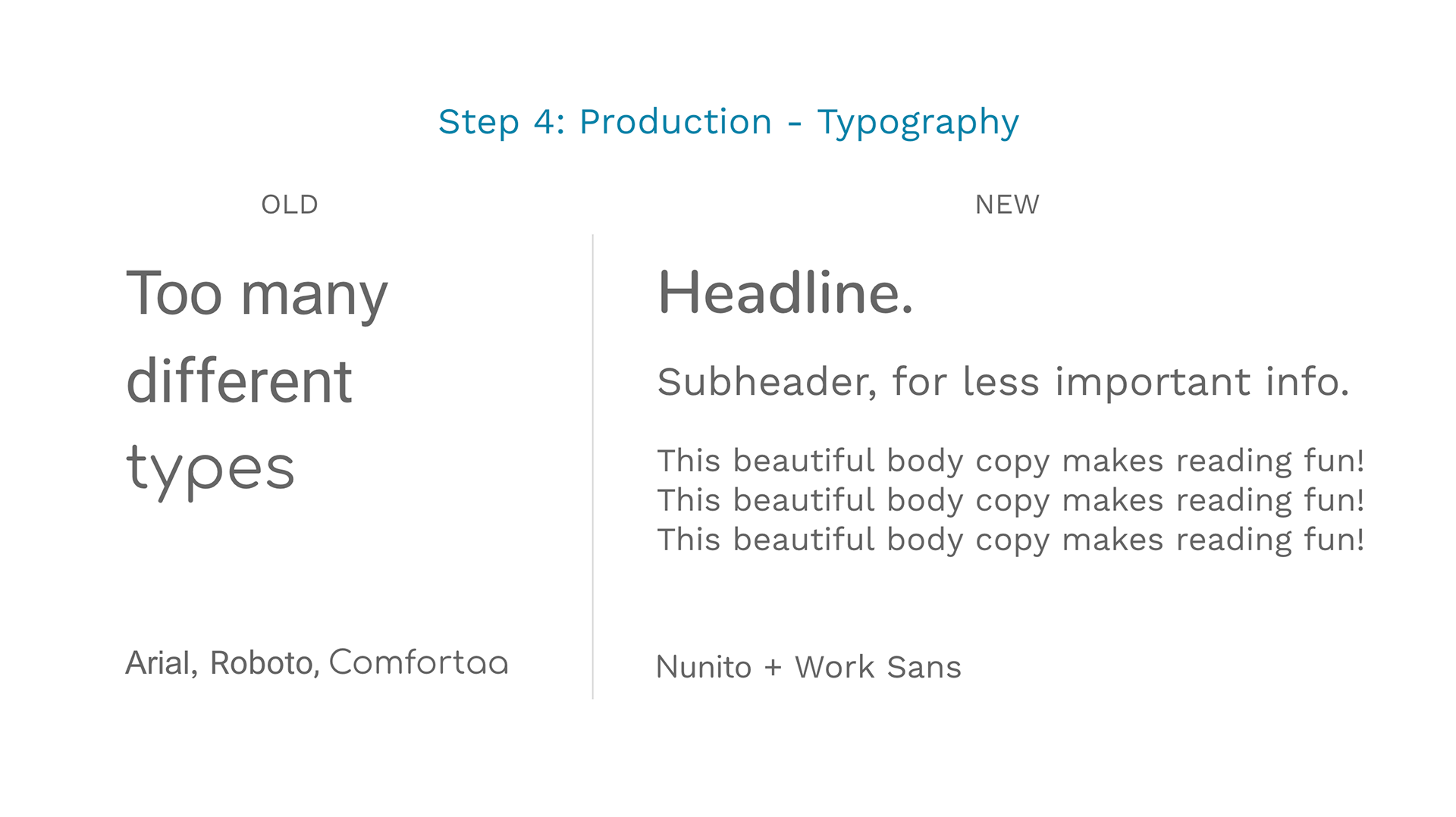
As a non-profit, they do not a lot of money, so we used Google type to make production easy in Google Slides, Docs, etc.
We chose a modern, clean, minimal typeface that was legible even at small sizes, but still has character.
For headers, Nunito is curved, perceived as open, connective and nods to the community aspect of the SB brand.
For body copy, Work Sans is clean, dynamic and seems like movement across the page.
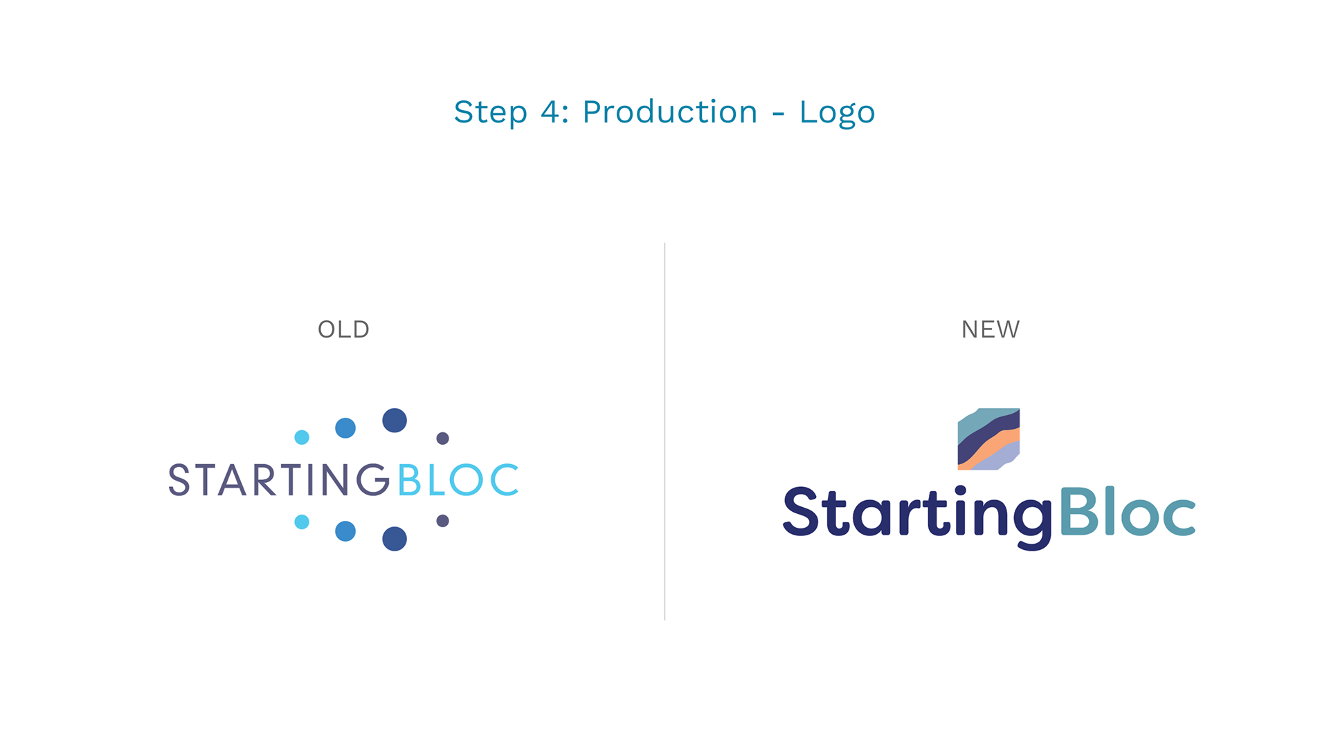
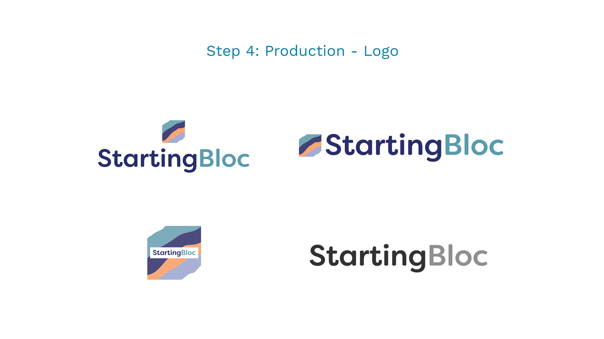
Icon: Abstract + Geometric
The point was to create something that everyone could see themselves in, but still feel unique as a brand.
Colors represent the diverse community, perspective, and experiences of people.
Movement in the square echoes the elements of transformation and growth that happens during the fellowship experience.
The mind fills in the negative space to create the block (so we have a block without being so literal).
The icon is reminiscent of geological rock layers, bringing to mind the various layers and foundation needed for building leadership (the starting...bloc).
Word mark: Simple + Bold
Dynamic on its own with the 2 tones, just like someone who comes through the StartingBloc experience.
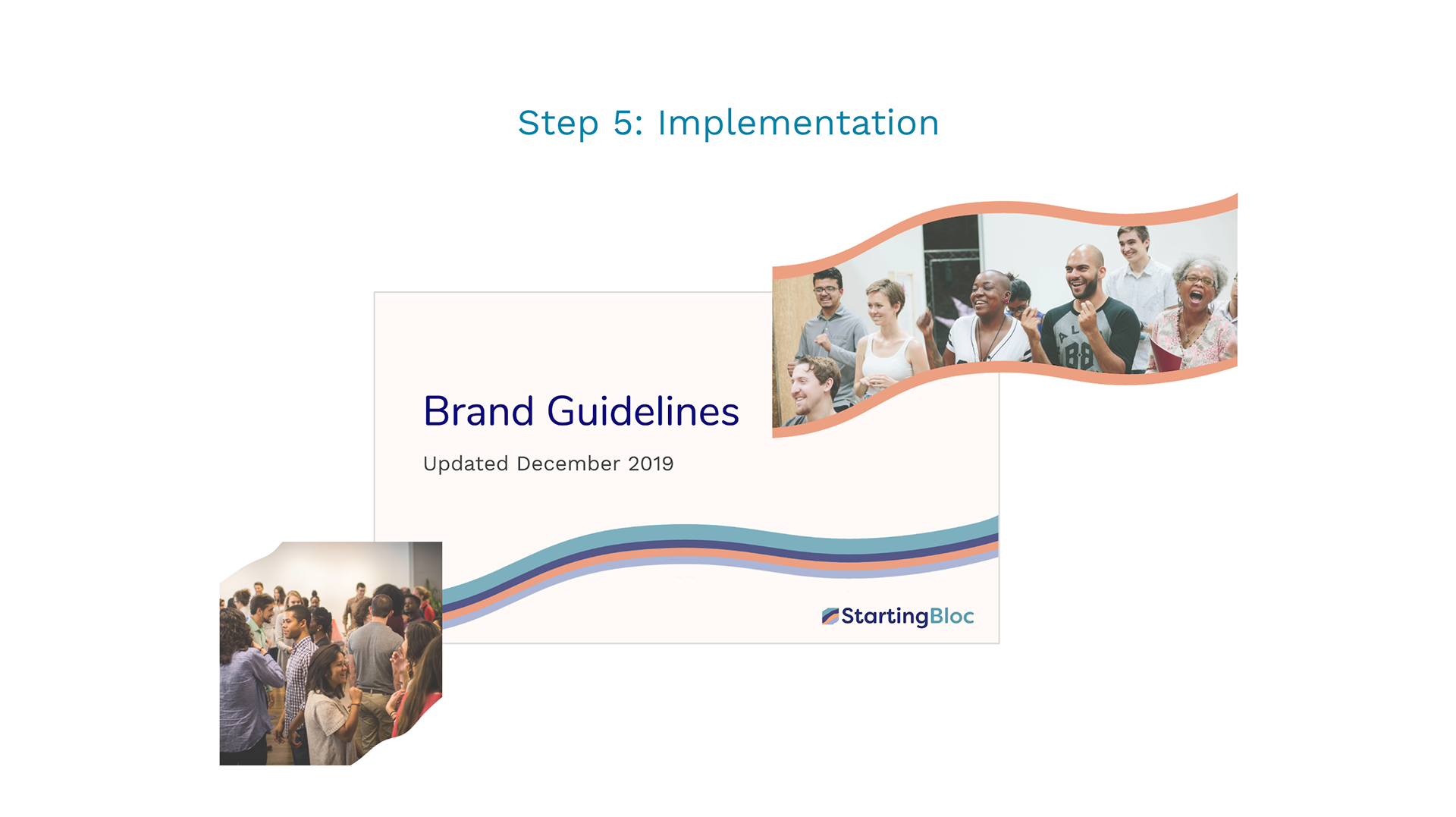
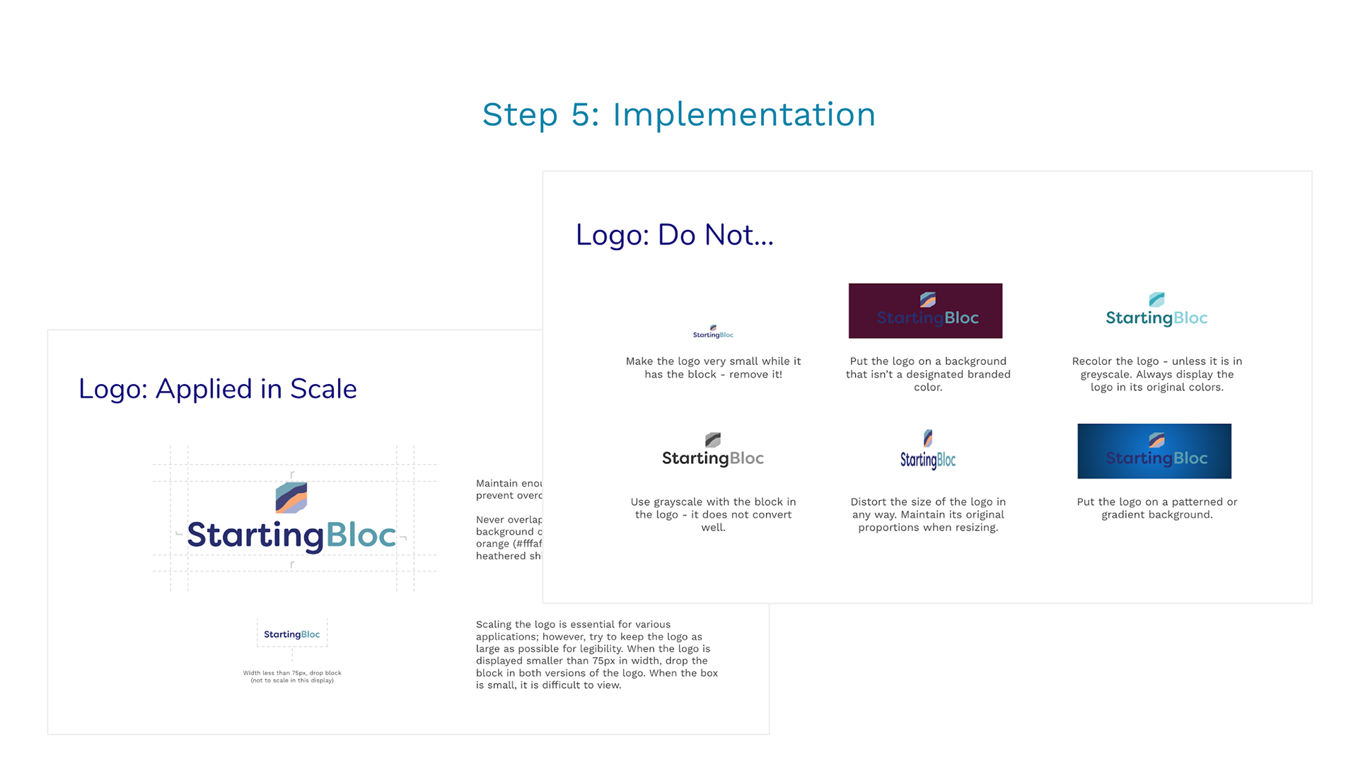
I created branding guidelines for leadership to use to make new content along with visual elements that continue the branded feeling of the organization without splattering the logo all over our content.